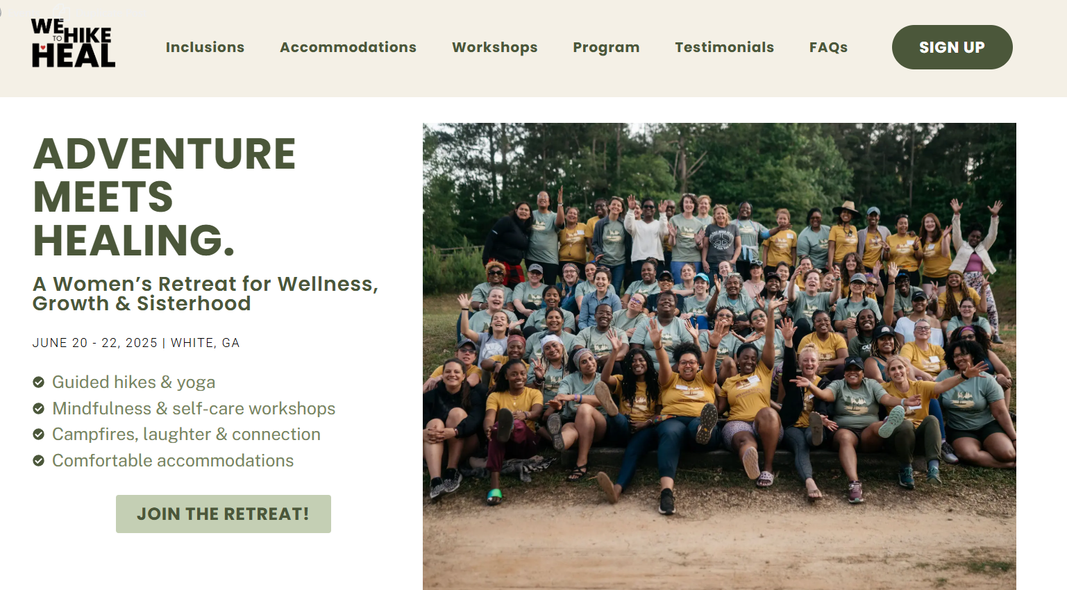
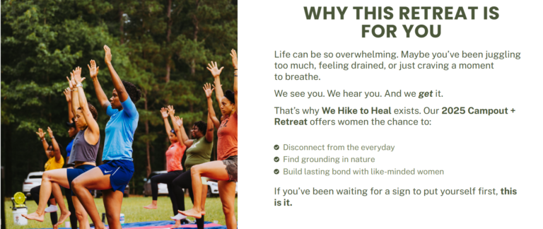
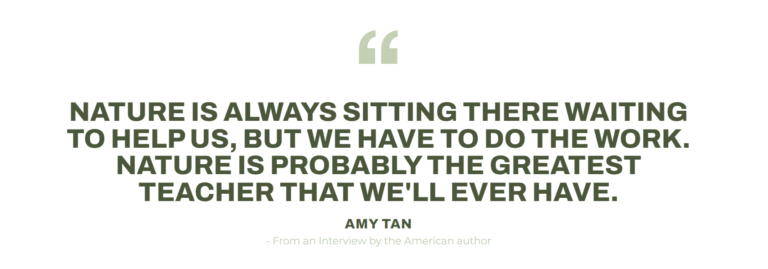
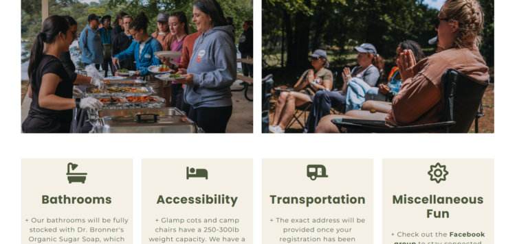
Landing page conversion optimization Link to original page Link to optimized page Above The fold Before Full top navigation with multiple menu links, increasing distraction and reducing conversion focus.Generic headline that lacked clarity and emotional pull.CTA button with generic wording (“Register Now”).Absence of campaign keywords for above the fold section. After Simplified navigation bar focused solely on the retreat, lowering attention ratio and reducing drop-off points.Strong, clear headline and copy that communicates the retreat’s unique value and emotional benefits.CTA button with action-oriented, emotionally resonant language (“Join the Retreat!”).Consistent use of campaign keywords to improve clarity, and reinforce relevance. Value proposition Before Only included a short paragraph explaining why the event was being held.Lacked a clear breakdown of retreat benefits or reasons to join.No testimonials or participant feedback present, resulting in low social proof.Message was focused more on the organizer’s intent rather than the audience’s transformation. After Added a clear, benefit-driven Value Proposition section highlighting what attendees will gain.Organized the value points using scannable formats like bullet points.Introduced a Testimonials section featuring feedback from past participants to build trust.Shifted the messaging to be audience-focused, speaking directly to visitor needs, desires, and outcomes. Service Information Before Contained only a single quote from an interview, with no strong context or support.Minimal imagery from past events. After Added a detailed Package Inclusions section outlining exactly what participants receive, which boosts transparency.Included multiple authentic photos from previous retreats, giving visitors a real sense of the atmosphere and community. FAQs Added a clear, organized FAQs section addressing common concerns, improving user confidence and increasing the likelihood of conversion.